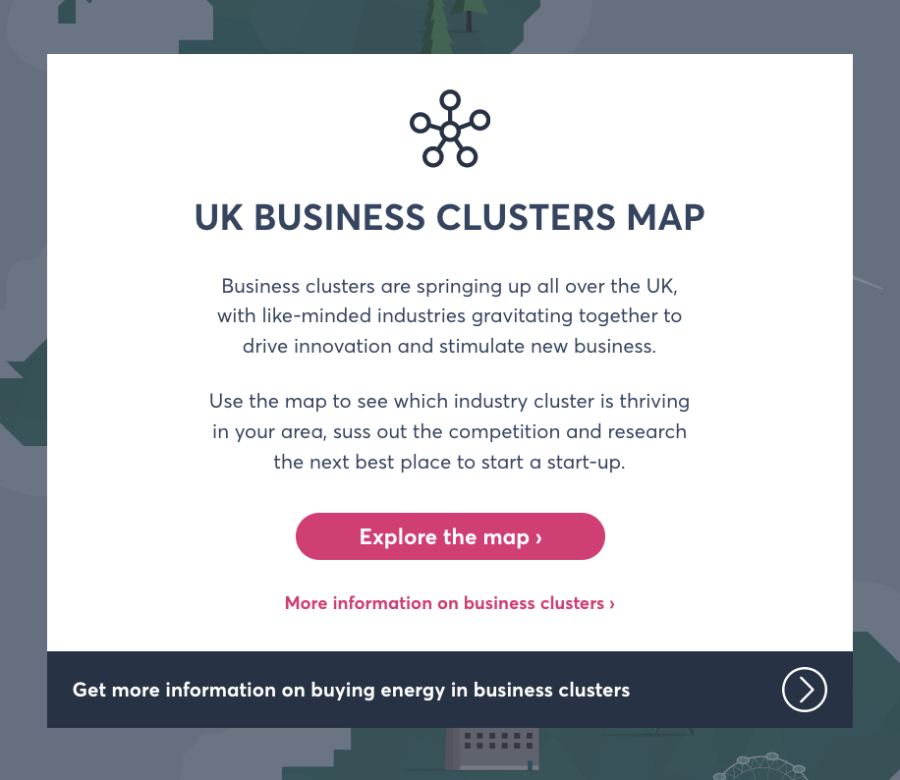
In 2017 Opus Energy wanted to create an interactive map that would allow users to explore clusters of different industry sectors across the UK and compare various metrics between them. Their goal was to provide an intuitive and engaging tool for businesses, analysts, and policymakers to visualise industry distributions and make data-driven decisions. To bring this vision to life, Blucube was brought on board to research suitable technologies and ultimately deliver the final product.
From the outset, we knew that an effective mapping interface needed to be fast, responsive, and user-friendly. Initially, we experimented by building a custom JavaScript pan/zoom interface, but soon realised that we were essentially writing a mapping UI from scratch and that using an existing library would probably make more sense. We checked out several options before deciding to go with the open source Leaflet library, overlaying the vector outline map of the UK and the animations, and using real-world latitude and longitude coordinates to position everything.
The playful illustrated style of the map and its animated features were designed by Wes West (now running his own animation studio Jolt).
The final product was a sleek, interactive map that exceeded client expectations. The map allowed users to gain valuable insights into industry distributions and compare different regions effectively. This project not only provided Opus Energy with a valuable tool but also reinforced our expertise in delivering scalable and intuitive web-based solutions.
The success of this project highlighted the importance of flexibility in development, by pivoting from a custom-built UI to an established mapping library we were able to save development time while enhancing the end-user experience.
This was a really fun project to work on. It’s sadly no longer online, but if you’re interested in creating something similar and you’d like to have a play with our development copy, get in touch.
It's all very well showing you someone else's project, but we'd love to hear about yours.
Get in touch